DiamondBack Logo
Working with great people means that the endeavor is focused, productive, and as a bonus, enjoyable. This is one of those.
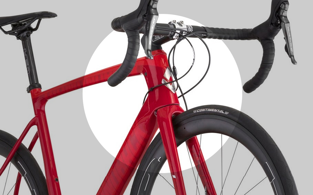
Tmarks was engaged to consult on the concept of a new logo for the head tube of DiamondBack bikes. Not the company identity, merely a new, lasting image for the headtube of the bicycles. Tmarks helped develop the creative approach and visual solution.
Working with the in-house creative lead for the project, we established goals, figured the intangible challenges and set about exploring directions. With the existing primary logo well established, we sought to define something that would support it but stand on its own. It should feel iconic and obviously, somehow tie back to the brand.


Originally designed as a Head Tube logo, the result was so successful that it has become the defacto logomark.

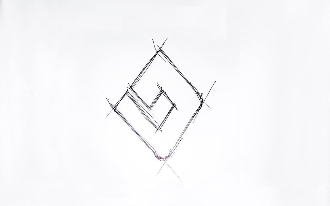
It was important in our minds to establish something that was iconic, that did more than took up space, that held meaning. Centered around a diamond, the angular letterform feels energized. The idea we favored was presented and approved in atypical short order and sent for 3D modeling.
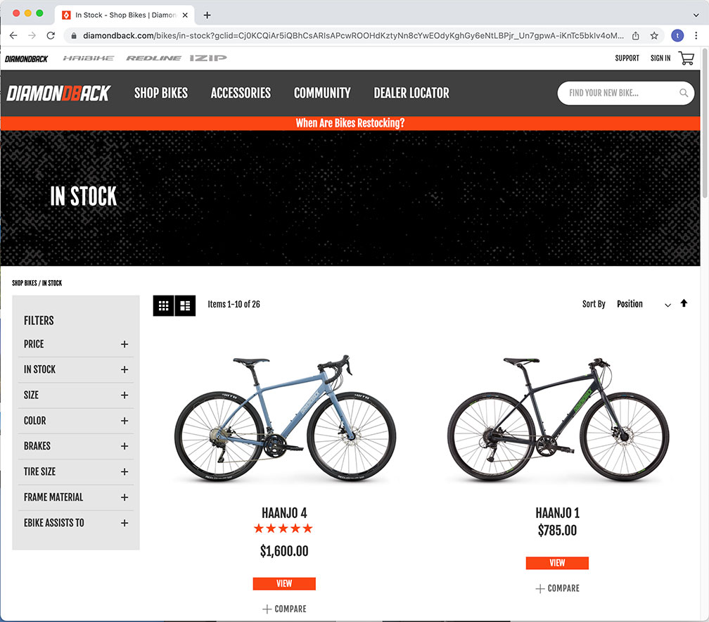
The result was very well received. So much so it was employed not only as the headtube logo, it was adopted as a secondary logo for the company. It can be seen all over the company site as well as on their social channels. Not a bad day at the office.


